UK banks and challengers ranked: from on-boarding to app functionality
An emergence of new technology and new start-up participants in the banking sector has caused a stir in recent years.
According to data from AT Kearny, more than one in five people in the UK use challenger banks in some shape or form. More than a third of UK residents in the millennial age group use a challenger as their primary bank.

More than one in five people in the UK use challenger banks in some shape or form.
The UK market is certainly one of the most populous when it comes to new entrants and challenger banks. Our own comprehensive list records over 100 of them.
The attraction for neobanks and start-ups is their ease-of-use and mobile application functionality. Fujitsu data from 2019 shows that 46% of people are interested in challengers due to their reputation for new technology.
But how do these new entrants really stack up against their competition in the UK marketplace?
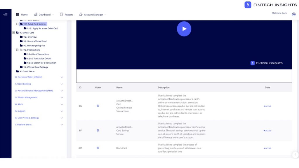
FinTech Futures recently had the opportunity to get to grips with FinTech Insights, a digital banking analysis platform from Scientia.
The system allows users to compare and contrast a variety of features and functionalities inherent in banking applications, based on their real processes.
For the purposes of this test, we decided to pick out thirteen popular UK banks – both challenger and incumbent – and compare how their tech stacks up.
HSBC, Barclays, Halifax, Lloyds, Santander, Tesco, Metro Bank, and TSB represent the “traditional” banks, while Atom, Monese, Monzo, Revolut and Starling comprise the challengers.
Which banking app offers the most functionalities?
Digital banking is offered across many channels and devices. Some Banks choose to offer their digital banking services on the web, others through mobile applications.
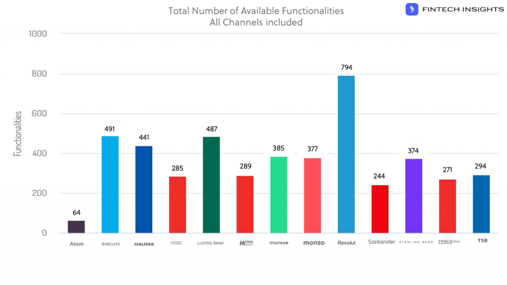
Among the mobile-first firms, the clear winner is Revolut. The data shows the fintech unicorn offers 794 distinct functionalities. That figure is almost double the amount of the next-best bank, Monzo.
For those who offer multi-channel banking, Barclays comes out on top with 491 functionalities. Lloyds follows with 487.

Although Revolut beats Barclays handily in terms of the features offered, is that necessarily a good thing?
“It really depends on many factors. One of them is the equilibrium of the user experience one provides for every one of those functionalities,” says Alexandros C. Argyriou, chief executive officer at Scientia.
“You may offer a lot, but if at the end of the day if your user experience is lacking so much that your users get frustrated trying to manage their finances, it might be a lost cause.”
How many features do UK challenger banks have over traditional banks?
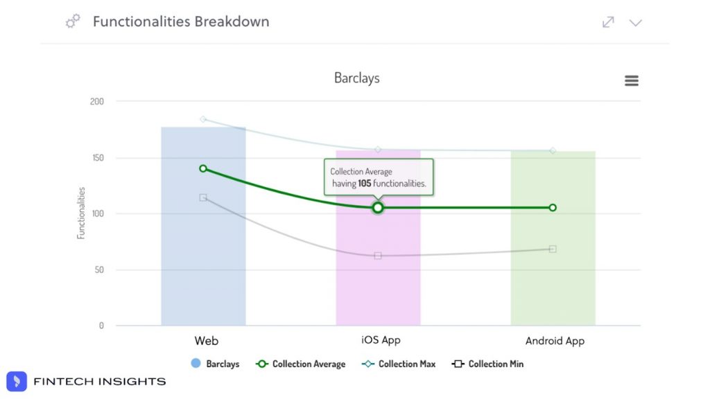
To answer this question, we had to create two market groups in the FinTech Insights platform. The system told us that across the challenger group (mentioned above) the average number of features is 200. When it comes to traditional banks the number falls to 105.
It’s worth mentioning that these figures are exclusively for the mobile channels. Some challengers do not offer a web-based banking system. Across the web channel, the average number of features offered by incumbent banks was 140.

What are the differences in onboarding between a traditional bank and a challenger bank?
A key selling point for challenger banks is that their apps are easy to use, and their accounts easy to sign up for. But are they that much different from traditional banks, who have strived to catch up?
Details on the actual processes for each bank can be found in the FinTech Insights platform’s user journey flowcharts. However, some general trends did emerge:
Most high street banks use personal information as a verification method. Users of some high street banks decide on a memorable word and a password in order to be verified later within the online platform. Customers of particular challengers use a recorded phrase.
Challenger banks also require fewer information points. Usually this is a full name, phone number and email address. High street banks require more: for example, most high streets ask for average income information, as well as proof of address.
Some incumbents promise an entirely in-app process but fail to live up to it. Santander UK requires users to open a web page on their mobile during the application process.
There is also some difference in verification processes. While Revolut requires two photos of a passport, most traditional banks ask for a series of uploaded documents, or a photo which must be verified after a period of time.
Which banks/fintechs offer the fewest steps to activate an account?
Even though the platform allows an easy answer for this, spending a few weeks with the platform made us realise that it’s not just about steps or clicks or typing.
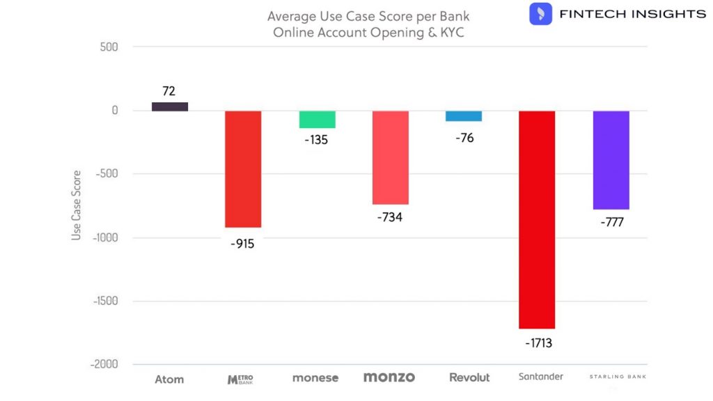
Out of the list of UK Banks we have selected, Atom has the fewest steps to activation of an account – 40 to be exact. Atom also rated highest in its user journey score, at 72/1000, based on Scientia’s UX methodology.

But having fewer steps does not correlate directly to have the user best experience. Looking abroad from the UK, we found that SoFi has just 33 steps to open an account, and a score of 230/1000. Bunq has 43 steps and a UX score of 139/1000.
Usually it is about the complexity of each individual step, not about how many there are. You can have the same number of steps, and in one case have them all be clicks and in another case have to type all the answers out. Different steps attribute to different amounts of friction.
Which style of bank has the best card management?
According to FinTech Insights, challenger banks rule the roost when it comes to card management. These banks have all the latest trends: limits, blocking and unblocking, and PIN reminders being chief among them.
The platform reports that blocking and unblocking of cards is still missing from most high street banks, as is requesting a PIN reminder.
Revolut has a total of 57 features related to card management for its iOS application. 31 of these are unique to the fintech unicorn among its peers. High street banks have an average of just ten.
The FinTech Insights platform shows that there are few services for card management among the high street banks. Most may start from their digital banking, but finish on a branch or on the phone.

As the digital banking and fintech environment is constantly evolving, it’s crucial for banks to be able to understand their competitive landscape. They should identify where their competitors excel, or even better, what they can learn from their mistakes.
We’ve seen digital banking teams trying to reinvent the wheel every time they wish to add a feature or to improve a journey. That approach is losing its feasibility, as time and money constraints bite in 2020. The delay in releasing a feature or its improvement can also cause a significant opportunity cost.
Using competitive analysis like that provided by FinTech Insights gets behind the marketing and the documentation. It creates a window into how banks solve the same problems and how they tackle the same regulation. It’s a vital piece of a toolkit to help beat competitors to the punch and emerge a frontrunner in an increasingly competitive market.
For more visit: https://scientiaconsulting.eu/


