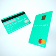
Starling Bank takes on Monzo with daring debit card design
UK digital challenger Starling Bank is upping its design game with the launch of a new teal-coloured vertical debit card as it plays catch up with Monzo.
 The new card has all customer details, including name, card number and expiry date, on the back – and it’s rolling them out this week.
The card is inspired by the blue-green tones of the plumage of the starling bird. It is also one of the initial group of 16 original “web colours” formulated in 1987 to display web pages, reflecting Starling’s digital heritage.
The business account card will also be vertical, but it will be dark navy instead.
Starling claims it’s the first vertical card in the UK, but actually it is not – another challenger banking service provider, Tide, already has a vertical card (it just hasn’t done a massive marketing campaign about it).
Gold where there are sparkles
If you haven’t seen Starling’s old card, don’t bother – it’s nothing special compared to Monzo’s bright coral-coloured card.
Monzo, in spite of having a nearly identical proposition, managed to rack up customers at a much faster pace than Starling. The original pre-paid card offering had a lot to do with this, but it’s hard to ignore the branding.
Monzo was quicker to get the brand out, and most importantly, its cards were very easy to spot throughout London. What’s more, they looked quite appealing for the millennial crowd.
Starling is now realising that to reign on the challenger market, you need more than good PR. Mark Day, Starling’s art director, says: “Great design is about more than just making things look good.”
Indeed, it’s also about making yourself recognisable. A bit late to the party, but sign me up to a vertical teal card any day.
“I’m fine with my horizontal Monzo card,” says Alec Gost, a Monzo user. But fine shouldn’t be enough, Alec. You could be great.
Starling has now a wider offering and features than Monzo, with business and joint accounts. It’s just missing people to consume it.
Note that Starling is not the first one to come up with a vertical card. Penta Bank, in Germany, already has a bright vertical card with all its details on the back. And Venmo, in the US, lets you customise the colour of your vertical card. What a time to be alive.


Really…a vertical card design…lets up things and release a eco friendly card that’s bio-degradable.
Come on Starling what about CLO, soft rewards or a loyalty gateway to enable loyalty programs to offer conversion of points as a cashback mechanism via merchant funded process post purchase which actually might attract customers and engage on a day to day basis.